

Sigarettenkoker
The Elegance and Utility of a Cigarette Case A cigarette case is a small, often stylish container designed to hold and protect cigarettes. Traditionally crafted from materials like metal, leather, or even precious materials such as silver or gold, these cases serve both practical and aesthetic purposes. Beyond mere functionality, they reflect personal taste, social status, and even historical trends. Historically, cigarette cases gained popularity in the early 20th century, particularly during the 1920s and 1930s, when smoking was a widespread social habit. They were not just accessories but symbols of sophistication. Many cases featured intricate engravings, monograms, or art deco designs, making them fashionable statements. Some were even gifted as tokens of affection or commemorative items. Functionally, a cigarette case prevents cigarettes from being crushed in pockets or purses, maintaining their shape and freshness. Many designs include a hinged lid that snaps shut securely, while others may have a sliding mechanism. Some cases also incorporate a built-in lighter compartment, adding convenience for the user. In modern times, while smoking has declined in many societies, cigarette cases remain collectible items. Vintage cases are sought after by enthusiasts for their craftsmanship and historical value. Contemporary versions may prioritize minimalism, using materials like brushed steel or carbon fiber for a sleek, modern look. Beyond their original purpose, cigarette cases have also been repurposed as holders for business cards, small notes, or even vaping accessories. Their compact and durable design makes them versatile. Ultimately, a cigarette case is more than just a container—it is a blend of utility and artistry, a relic of a bygone era that continues to hold charm and functionality in today’s world. Whether as a collector’s item or a practical accessory, it remains a testament to timeless design.
Product
Classificatie:
-
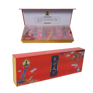
J IU en TI pers sigarettenpakje van het merk
Hun classificatie: SigarettendoosjeBekeken: 2033Nummer:Release tijd: 2025-09-23 09:32:58De verpakking van dit product trekt op het eerste gezicht de aandacht met zijn visueel opvallende ontwerp. De primaire kleur is rijk, levendig, echt rood; geen gewoon pigment, maar een speciaal samengestelde inkt van hoge kwaliteit, afgewerkt met een glanzende coating. Hierdoor ontstaat een oppervlak met een warme, diepe, glazuurachtige glans die niet alleen glinstert onder licht, maar ook een substantiële, luxueuze textuur overbrengt bij aanraking, wat duidt op de uitzonderlijke waarde van de inhoud. Het visuele middelpunt van de doos zijn ongetwijfeld de vier krachtige personages in het midden: “Jiu He Tian Xia” (Unite the World Through Moxibustion). Ze zijn vervaardigd in een plechtig lettertype en worden zorgvuldig gepresenteerd door middel van goudfoliedruk. Dit goud is niet eenvoudig heldergeel, maar een subtiel, korrelig donker goud dat stabiliteit en nobelheid uitstraalt. Elke streek is scherp gedefinieerd en driedimensionaal. Tegen de levendige rode achtergrond lijken de personages als een bas-reliëf uit de doos te springen, wat zowel de grootsheid als de veelbelovende symboliek van het merk belichaamt. Het meest verfijnde detail schuilt in de decoratieve motieven die de tekst flankeren: de draak en de feniks, heilige beesten uit de traditionele Chinese cultuur. Dit zijn niet zomaar platte prints, maar zijn gemaakt met behulp van complexe laagtechnieken om verbazingwekkende diepte en ingewikkelde details te bereiken. De draak hierboven, behendig en krachtig, kronkelt tussen de wolken. De vorm is voornamelijk omlijnd in goud, met duidelijke schubben die glinsteren met een metaalachtige glans. Er worden diepe koningsblauwe accenten gebruikt om schaduwen weer te geven en een gevoel van kracht over te brengen, waardoor de draak majestueus en dynamisch wordt. Beneden vertoont de feniks een elegante houding, met gespreide vleugels terwijl hij achteromkijkt. Het verenkleed heeft rijkere, levendigere tinten, gedomineerd door rode en gouden tinten die kunstig samengaan met de rode achtergrond van de doos en toch opvallen. De punten van zijn vleugelveren zijn blauw omlijnd, waardoor een kleurenecho ontstaat met de draak erboven. Rondom de draak en de feniks kunnen veelbelovende wolken of vlampatronen wervelen, die gezamenlijk een harmonieus tableau vormen van ‘Draak en Feniks die voorspoed brengen’. Dit symboliseert eer, geluk en oprechte zegeningen. Deze verbluffende visuele effecten worden bereikt door de integratie van hoogwaardige print- en afwerkingstechnieken. Ten eerste voorziet de nanocoatingtechnologie de hele doos van een robuuste, krasbestendige en vochtbestendige beschermlaag en geeft deze een duurzame, briljante glans. Ten tweede wordt UV-zeefdruk gebruikt voor de meest verzadigde en levendige delen van het Dragon-Phoenix-ontwerp. Deze techniek zorgt voor een dikke, rijke inkttoepassing met sterke dimensionaliteit en onmiddellijke droging, waardoor pure, duurzame kleuren worden gegarandeerd. Ten derde glanst reliëf (of reliëfdruk) op ingewikkelde details zoals de contouren, schubben en veren van de draak en de feniks. Fysieke druk creëert subtiele reliëfeffecten, waardoor de delicate texturen zelfs zonder zicht voelbaar zijn – simpelweg door aanraking – wat de artistieke aantrekkingskracht en interactiviteit van de verpakking aanzienlijk vergroot. Ten slotte siert de finishing touch van goudfoliedruk niet alleen de letters van het merk “Jiuhe Tianxia”, maar schetst ook op subtiele wijze geselecteerde contouren van de draak en de feniks. Dit voegt een oogverblindende metaalachtige glans toe te midden van de rijke kleuren. Over het geheel genomen overstijgt deze “Jiuhe Tianxia”-verpakking louter functionaliteit: het staat als een kunstwerk dat traditionele esthetiek combineert met modern vakmanschap. Het levendige maar harmonieuze kleurenpalet, de symbolisch rijke motieven en de zorgvuldig verfijnde technieken creëren gezamenlijk een krachtige visuele spanning en culturele resonantie. Dit ontwerp brengt niet alleen de premium positionering van het merk over, maar transformeert elke handeling van hanteren en openen in een rituele esthetische ervaring. -

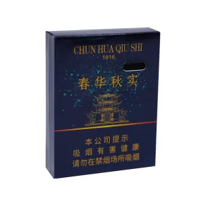
Chrysant sigarettenverpakking
Hun classificatie: SigarettendoosjeBekeken: 2091Nummer:Release tijd: 2025-09-23 09:33:22Deze sigarettendoosverpakking maakt gebruik van een unieke en voortreffelijke sneeuwvlokdruktechniek, waardoor een onderscheidende, hoogwaardige textuur ontstaat die zowel visueel als tactiel uitzonderlijk is. Door dit gespecialiseerde drukproces ontwikkelt het oppervlak van de doos een delicaat, onregelmatig patroon van witte stippen die op sneeuwvlokken lijken. Deze sneeuwvlokpatronen zijn niet mechanisch uniform, maar op natuurlijke en willekeurige wijze verspreid over de verpakking. Sommige gebieden zijn dicht bedekt, terwijl andere schaars blijven, waardoor een licht, dynamisch en natuurlijk suggestief visueel effect ontstaat. Het lijkt op een delicate laag verse sneeuw die zich stilletjes op de gouden doos nestelt, wat een vleugje romantiek en elegantie toevoegt aan het algehele ontwerp. Naast visuele innovatie introduceert de sneeuwvloktechniek tactiele rijkdom. Als u uw vinger lichtjes over het oppervlak van de sigarettendoos laat glijden, worden duidelijke, subtiel gestructureerde ribbels en groeven zichtbaar. Deze unieke tastsensatie breekt met de gladheid van traditionele glanzende verpakkingen, waardoor gebruikers een tastbare, gestructureerde interactie kunnen ervaren zodra ze de doos oppakken. Dit verhoogt de algehele ervaring en waargenomen waarde van het product aanzienlijk. De verpakking heeft een luxueus en toch verfijnd goud als primaire kleur, wat de premium positionering van het product onderstreept. In het midden van het voorpaneel is een levendige gele chrysantenbloesem op ingewikkelde wijze weergegeven. De elegante, delicate vorm harmonieert naadloos met de gouden achtergrond en dient tegelijkertijd als centraal punt – een meesterwerk dat een aura van verfijnde, nobele oosterse esthetiek uitstraalt. Naast de chrysant valt de merknaam “Nan Zhu” op in opvallende rode Chinese kalligrafie. Het rood creëert een opvallend contrast met het goud en geel, waardoor de merknaam wordt benadrukt en de verpakking een traditionele, levendige culturele uitstraling krijgt. Als tabaksproduct staan er uiteraard duidelijk verplichte gezondheidswaarschuwingen op de verpakking, zoals ‘Roken is schadelijk voor de gezondheid’ en ‘Roken versnelt huidveroudering’. Deze teksten voldoen aan de wettelijke vereisten op het gebied van ontwerp en typografie, waarbij het noodzakelijke onderscheid met het algehele artistieke ontwerp behouden blijft en tegelijkertijd naadloos geïntegreerd wordt in de lay-out van de verpakking om te voorkomen dat ze schokkend overkomen. Samenvattend creëert het sigarettenpakje “Nan Zhu” met succes een unieke gedenkwaardige verpakkingservaring door zijn visuele, tactiele en culturele aantrekkingskracht. Dit wordt bereikt door de slimme integratie van sneeuwvlokvakmanschap, een gouden kleurenschema, chrysantmotieven en kalligrafische tekst. -
Lente bloei, herfst oogst merk sigarettenpakje
Hun classificatie: SigarettendoosjeBekeken: 874Nummer:Release tijd: 2025-09-26 17:07:12Dit sigarettenpakje "Spring Bloom, Autumn Harvest" is een meesterwerk dat klassieke esthetische gevoeligheden naadloos combineert met moderne designtaal. Het algehele palet concentreert zich op een diep blauw – niet een gewoon inktblauw, maar een serene tint die doet denken aan de nachtelijke hemel of de diepten van de oceaan. Deze kleur symboliseert wijsheid en standvastigheid en creëert tegelijkertijd een mysterieuze en verheven toon voor het hele ontwerp, wat beelden oproept van de grenzeloze kosmos of een zich ontvouwend landschapsschilderij uit de Song-dynastie. Op ingenieuze wijze heeft de ontwerper dit diepblauwe oppervlak niet blanco gelaten, maar er kunstig lichtblauwgroene vlekken op aangebracht. Deze stippen zijn met opzet zo dicht mogelijk en met weinig tussenruimte gerangschikt, waarbij hun koele, doorschijnende tinten doen denken aan de schaarse sterren aan de nachtelijke hemel of aan het mistige effect van inktdruppels die op natuurlijke wijze in water diffunderen. Ze stralen een dynamisch gevoel van adem uit en belichamen de schoonheid van oosterse penseelvoering uit de vrije hand. Deze techniek doorbreekt de eentonigheid van een enkele kleur en geeft de verpakking een gevoel van vitaliteit. Het vat op abstracte en artistieke wijze de vitaliteit van ‘lentebloesems’ en de overvloed aan ‘herfstoogst’ samen in deze compacte ruimte. Tegen deze dromerige achtergrond vallen de vier karakters “Spring Bloom, Autumn Harvest” prominent op, uitgevoerd in oogverblindende foliedruk. De typografie maakt waarschijnlijk gebruik van een waardig en groots regulier schrift of van een speciaal ontworpen kalligrafisch lettertype met krachtige lijnen en een stabiele structuur. De foliedruk geeft elk personage een rijke, glanzende metaalachtige glans. Tegen de diepblauwe achtergrond schijnen ze als de helderste sterrenbeelden onder de sterren, symboliseren ze de natuurlijke cyclus en de prachtige betekenis die belichaamd is in de merknaam – ‘lentebloesems, herfstvruchten’ – en vieren ze het verstrijken van de tijd en de ultieme oogst. Onder de merknaam ontvouwt zich een prachtig weergegeven Chinees architectonisch motief, dat lijkt op paviljoens en torens met hoge dakranden. De lijnen van het patroon zijn delicaat en precies, de structuur is zorgvuldig samengesteld. Hoewel het een miniatuurlandschap is, behoudt het elke nuance van het ritme en de grandeur van de traditionele architectuur. Dit detail leidt op subtiele wijze de gedachten van de kijker naar de rust en poëzie van klassieke tuinen, en harmonieert perfect met de literaire beelden van ‘lentebloesems en herfstvruchten’. Samen construeren ze een visueel poëtische ruimte. Het architecturale patroon maakt waarschijnlijk gebruik van foliedruk of ultrafijne lijnen, die de bovenstaande tekst weerspiegelen en het algehele gevoel van weelde en eenheid verder versterken. Samenvattend integreert deze verpakking met succes natuurlijke beelden (bloesems en fruit), temporele filosofie (lente en herfst) en cultureel erfgoed (architectuur) door de gestage diepte van de donkerblauwe achtergrond, de levendige speelsheid van lichtgekleurde spikkels, de grandeur van goudfolie-letters en de verfijnde elegantie van paviljoenmotieven. Het ontwerp zorgt niet alleen voor een rijke visuele diepte, maar toont ook nauwgezette aandacht voor detail, waardoor feilloos een elegante, diepgaande en cultureel rijke premium sfeer wordt gecreëerd die een blijvende indruk achterlaat.


Nieuws
Classificatie:
Geen zoekresultaten!
Geval
Classificatie:
Geen zoekresultaten!
Video
Classificatie:
Geen zoekresultaten!
Download
Classificatie:
Geen zoekresultaten!
Werving
Classificatie:
Geen zoekresultaten!
Aanbevolen producten
-
NEWS
J IU en TI pers sigarettenpakje van het merk
Meer informatie


 Telefoon